Chicago is a city of icons. You realize this quickly when trying this A-Z picture-taking walk downtown. The city has a character and it comes through strongly in its public lettering. Chicago letters are robust and classic – those Roman and Gothic influences chiseled everywhere you look. It can be a little chilly – you have to work harder to find anything off-beat or intimate. It means that some letter choices come off as obvious because they exert such gravity, but it’s futile to fight against planting one foot in that iconography. You just wouldn’t be doing right by Chicago if you did.
I started this walk after I arrived at Union Station at about 11:20am, and took a mostly-direct route to Michigan Avenue, a brief detour into Millennium Park, then across the river and then up to Navy Pier, where from 1 to 3 I had lunch with a friend and visited her office at Chicago’s NPR affiliate radio station.
When I left the light was already dimming, but I was well over halfway to the full alphabet. I did a lap around the pier and then, before too long on my path to the Chicago Red Line station, I had taken my last shots. It was a little after 4pm and becoming difficult to capture anything at the speed you tend to need in the middle of the urban bustle.
I feel like this batch is a big improvement on the San Francisco collection – and this time, I did it without having to cheat. It was much colder out, but I walked a couple less miles, and there were no hills, so I am not paying nearly as dear a muscular cost today.
Collection behind the jump
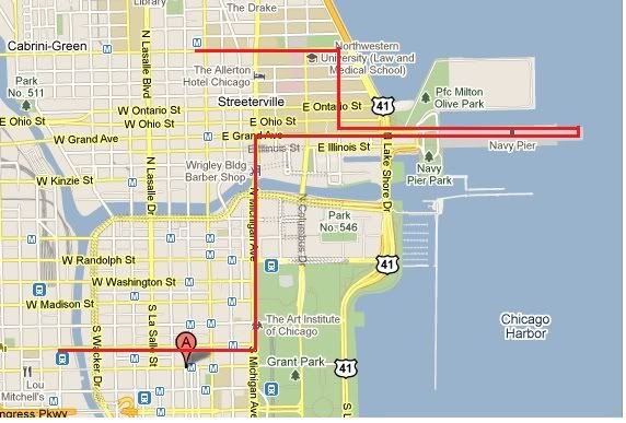
Approximate route
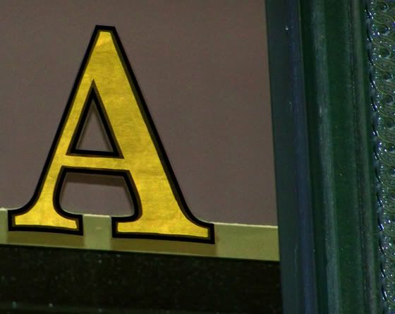
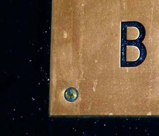
I made a rule for myself not to take pictures of ordinary street signs, but so many of Chicago’s high-rises are named, and usually have their name and address directly adorned somewhere, and that felt acceptable. I loved these aged metal plates, and since they all have the word “Building” on them, they are an ideal source for the letter “B”

Really, which other “C” could you use but the Tribune “C”? Like I said – icons.
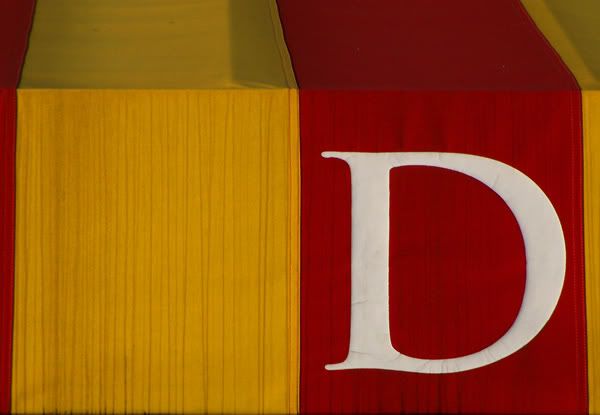
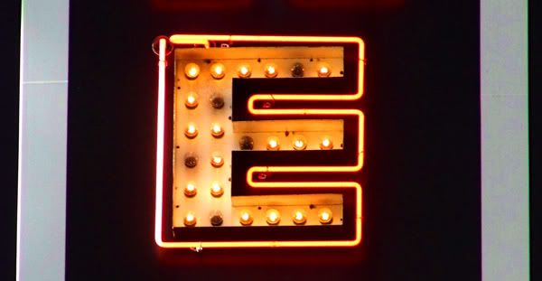
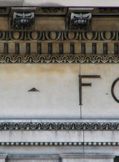
Really, I probably could have captured most of the alphabet just off of letters chiseled into stone. But I tried to save it for letters that I thought had particular character.
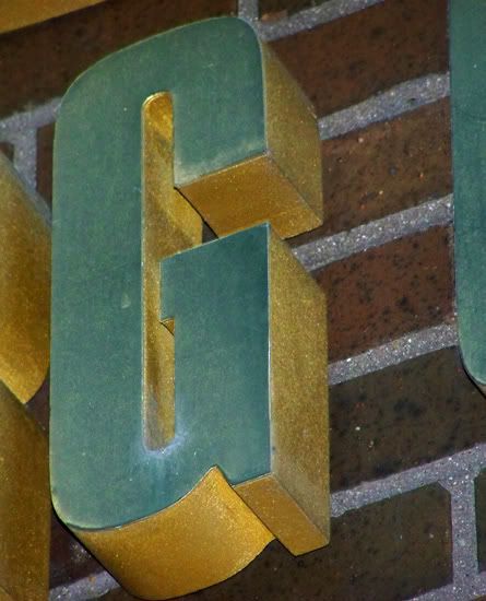


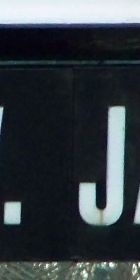
You cannot be choosy when it comes to the letter “J” on these walks, but even though this isn’t as sharp as I’d like I think the setting was actually appropriate, since it’s from the sign for a named water treatment facility. I appreciate that Chicago takes such open pride in its civic infrastructure, and that it likes naming things after people.
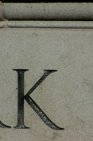
When you need a “K”, head for a park.
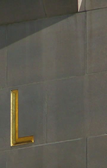
I’m really happy I managed to get this “L”, which was very high up and far away.
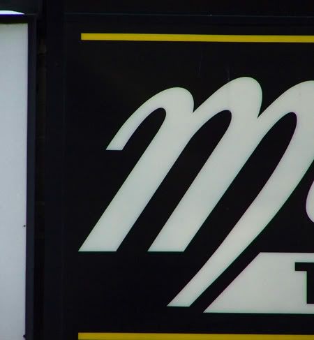
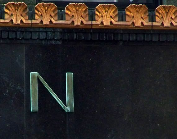
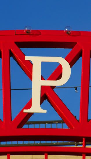
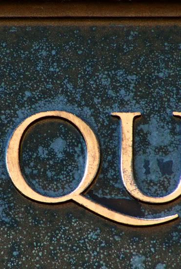
My impulse is to try and isolate the letters I’m capturing from any other letters – this is at its most difficult with “Q”. I think letterers sense the dependent relationship “Q” has with “U”, and feel it’s irresistibly natural to let that tail reach out to embrace its neighbor.

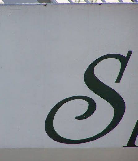
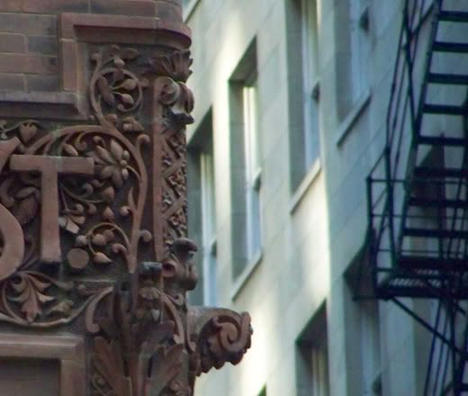

First shot of the day – at Union Station, naturally.


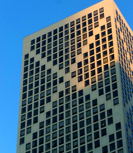
I found an “X” on a framing store awning relatively early in the day, which made me feel good since it is one of the rarer letters. But then, in the final phases of the walk, I looked up and there this was. “X” has a pleasing way of hiding in plain sight.
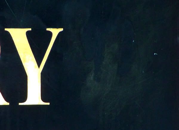
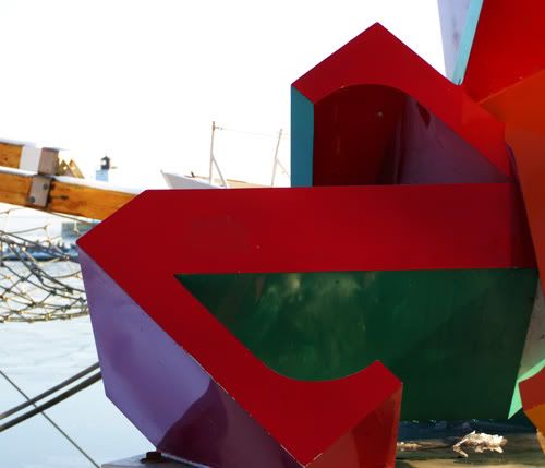
Remarkably, not only did I find three good-quality “Z”’s, I found them all while standing in essentially the same spot on Navy Pier, where the Funhouse Maze sits next to the tourist-trap version of the Billy Goat that sells “Cheezborger”. Both would have worked fine, but since the city took the trouble to leave a giant letter “Z” just laying playfully on the pier, I had to honor that.